
The new site design has been up for about a week now. Quite a lot has changed, both under the hood, and cosmetically. This is a multi-part series about the changes that have happened. Each part will dive into an aspect of the migration and decisions around it.
Each of these parts will turn into a link when it is released:
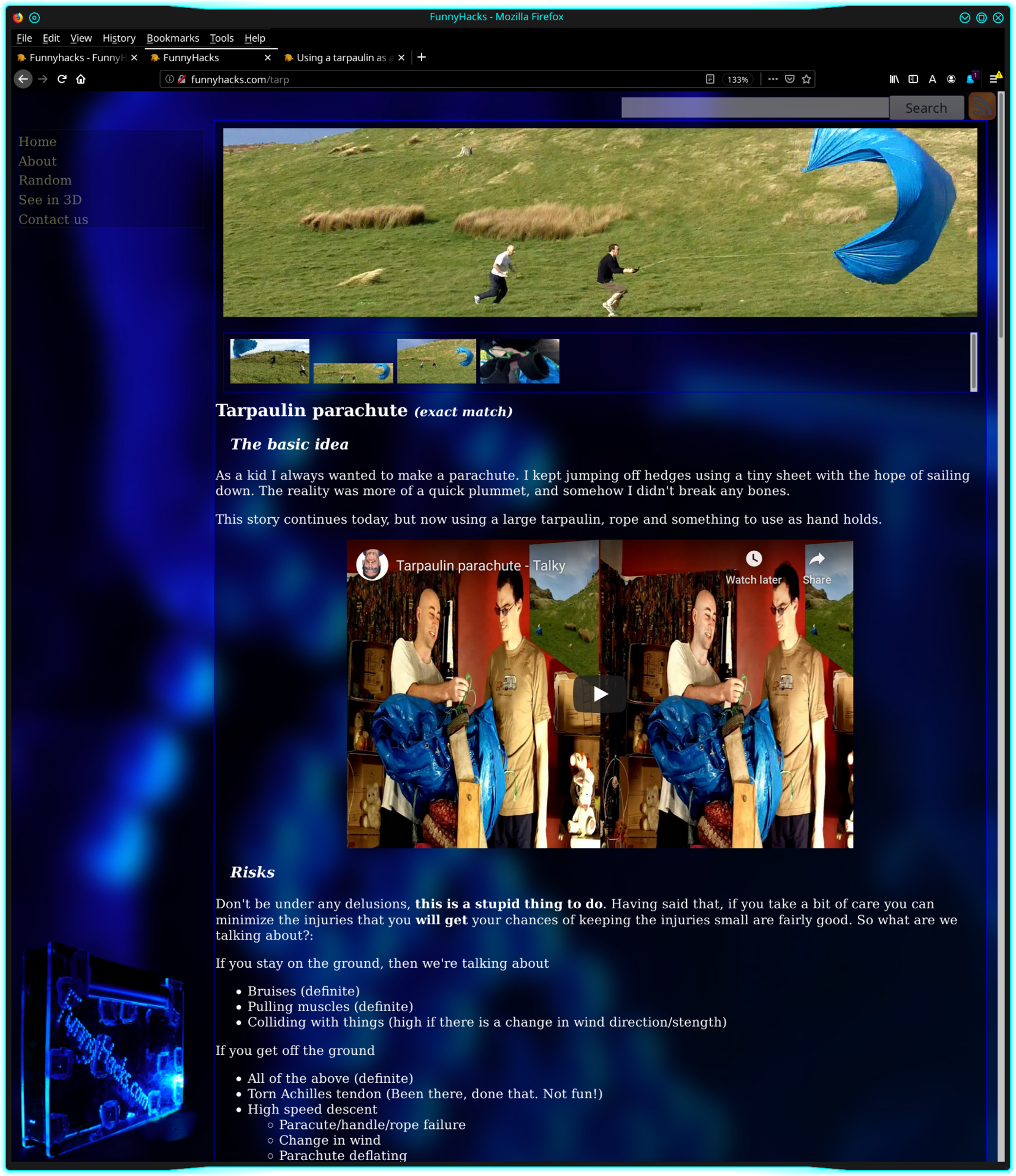
Above: Second Funnyhacks website. Without plugins enabled. (Natural)
I’ve been using this design for nearly a decade. It has worked well for me. But as the technology landscape, and my understanding of accessibility have evolved, it has become increasingly clear that it needed more work to get it up to the standard that I want, and want to advocate. So it made sense to begin that work after the migration.
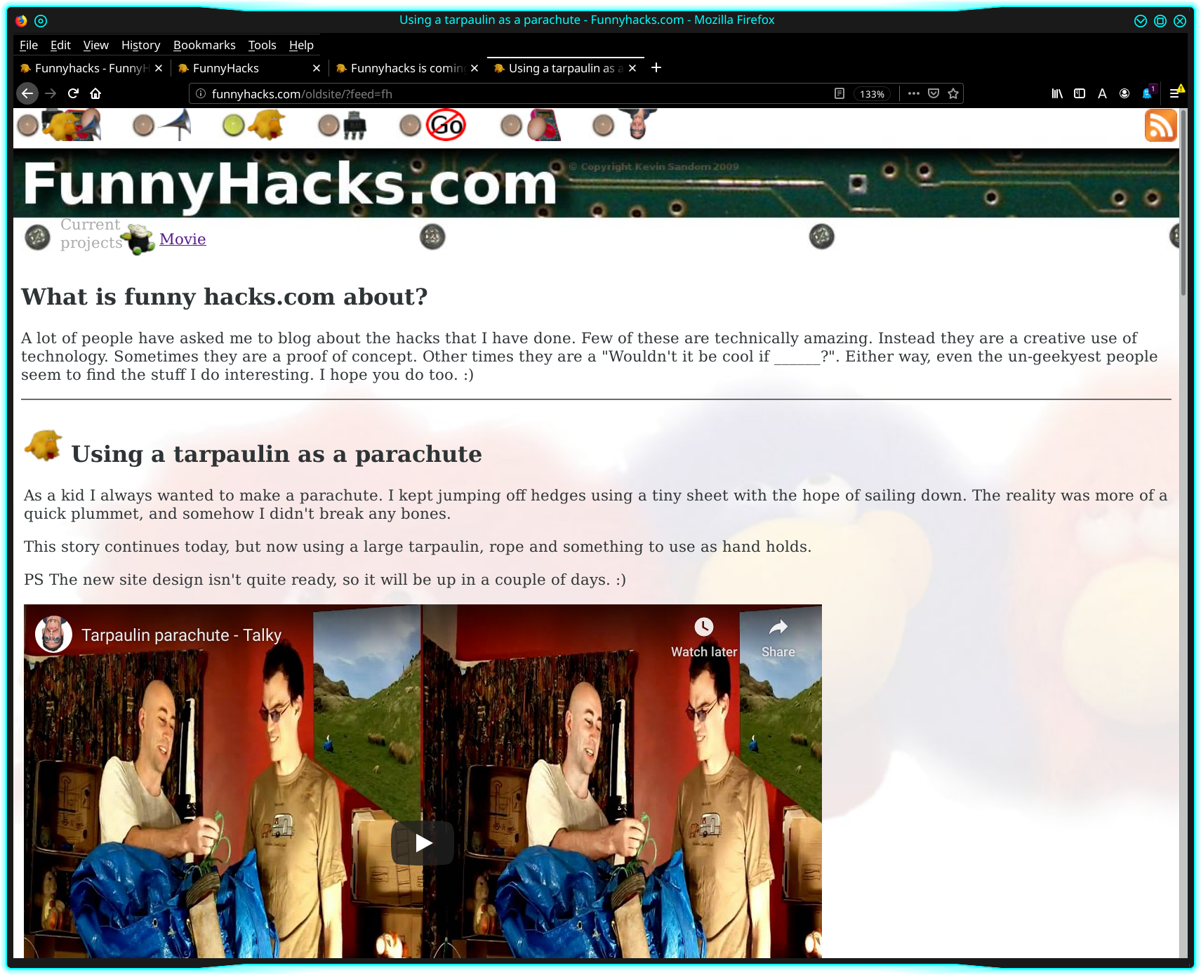
Interestingly, that was actually the second website I had for FunnyHacks.com. On the previous migration, it was easy to keep the previous website around. So I did that in the short term just in case I missed something in the migration. 10 years later I still had it up on /oldsite, and people were linking to it… D’oh! So one of my tasks of this latest migration was to get rid of this in an elegant way. I’ll discuss that more in the “Under the hood” post.
This is what the first site looked like:
Above: First FunnyHacks website.
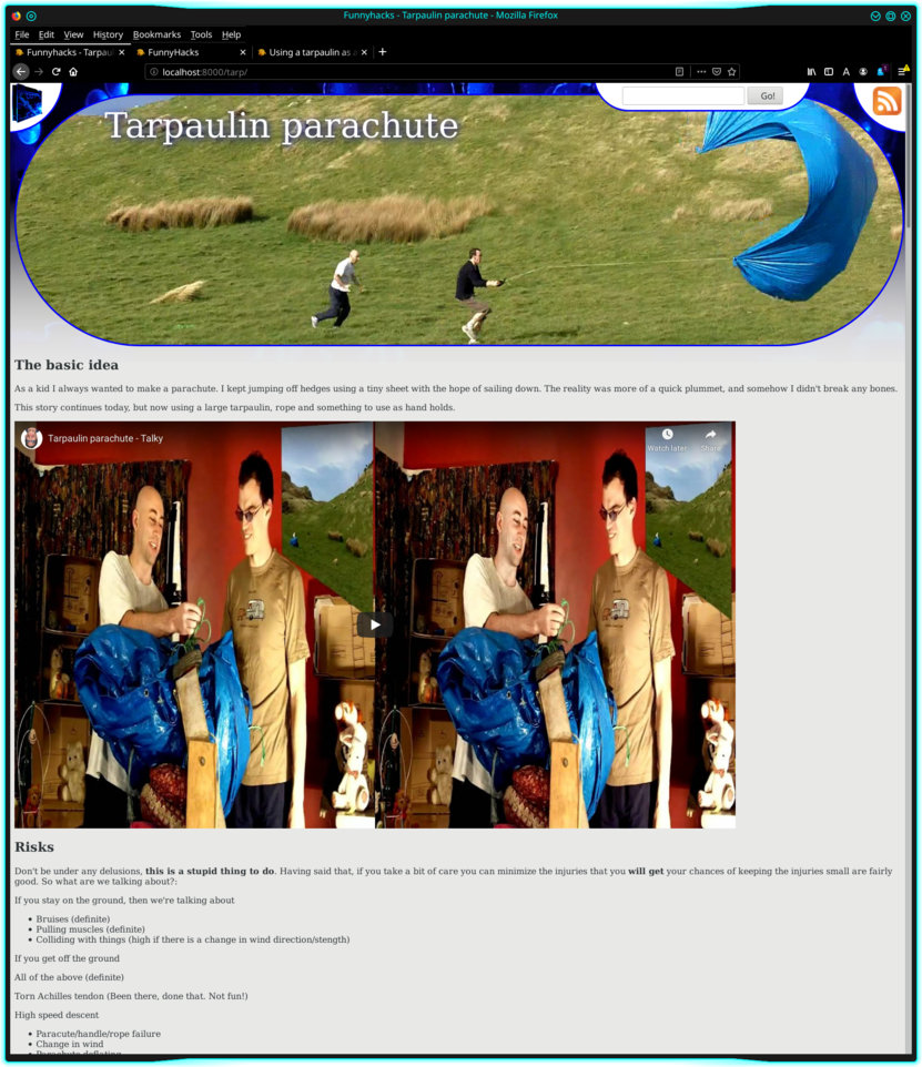
Above: Third/current site.
This is what it looks like now. I’m happy with both of my previous designs, but this is what I’m focussed on and excited about now. Read on to learn more about the decisions and thought that went in to it.
Given how central privacy issues have become, I think RSS is even more important than it was a decade ago. Therefore, this was a MVP feature. Ie I was not going to release the new site design without this feature being present.
With that in mind, even though this hasn’t changed, let’s do a recap of what’s available on this site.

Above: Screenshot of a feed of everything in the top right.
FunnyHacks.com is a low volume site. So I imagine this will be the most appropriate option for most people.
As of this writing, I still haven’t settled on the final look of this. But the gist of it is that it is the bigger RSS icon, sitting in the top right corner of the page.

Above: Screenshot of the tags used in the current page.
If there is an aspect of the current page that particularly appealed to you, for example /tarpaulin, there is both a link, which can show you what that matches, right now. And an RSS icon that you can use to subscribe to that tag. You’ll get a notification in your favourite RSS reader when ever there is a new post available.
Above: A related item show its image, a preview of its text, and its tags with RSS links.
Above: A related item on the old design.
In both of these, you can see what tags and feeds related items have, and choose what to subscribe to/view accordingly. Notice in the old webs site, it highlighted which tags were related to the current page. That’s functionality which I intend to bring back to the current design, but haven’t done yet.
The bottom line is: Make the most of these tags. If you are interested in a subset of what I do, this is an excellent way of focussing on what interests you.
Above: Background of the old site.
I love the look of the old site. But from an Accessibility perspective, it does almost everything wrong. The background is

Above: Background of the old site doesn’t obey the accessibility plugin.
By contrast, the new site begins with a default that should suit the majority of people.

Above: White background on the new site.
And it obeys the accessibility plugins that I’ve tested so far.

Above: Accessibility plugin active on the new site.
Above: Screenshot of the header with the various bubbles of information overlapping.
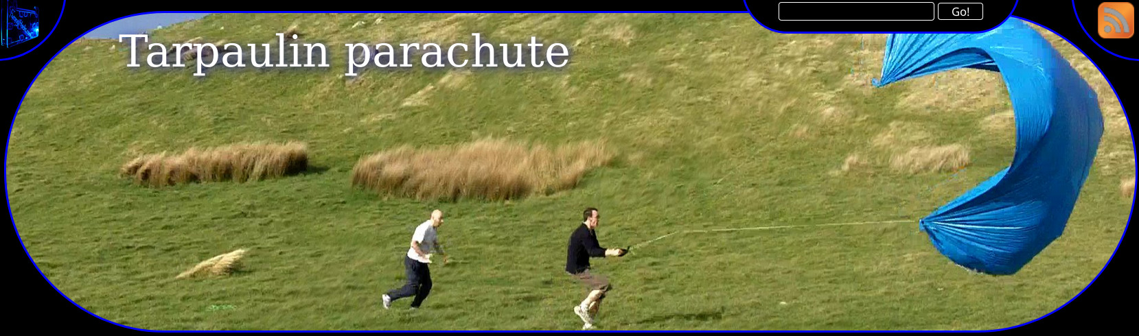
The vivid blue in the background of the header was made using the same image that I used to make the background for the previous website. It’s there to provide a familar link between the old design and the new design. It then fades to white as the eye moves towards the bottom of the header.
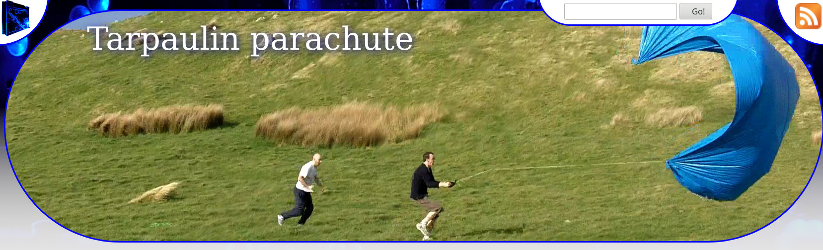
It provides familiarity to existing users, but it does not add to the understanding of the content. So I’ve specifically added it in a way that it either gets de-emphasised, or disappears when accessibility tools are used. By contrast, the title image (in this case, Tim and I experimenting with a home-made parachute.) forms an important part of telling the story, and therefore stays prominent when accessibility tools are applied.
Above: Header with an accessibility plugin applied.

Above: The side menu on the old site.
Over time, this delivered less and less value, while complicating making the site do expected things across different devices, zoom levels, and window sizes. It was time for it to go. The only feature I miss from there is “Random”, which I may re-introduce in the future in some other location. But now a whole heap of wasted screen realestate is reclaimed for focussing on the content.
Above: Screenshot of the header with the various bubbles of information overlapping.
While the old design focussed on fine lines and shades, the new design uses bubbles of information, with a focuss on readability. My wife asked me
Are the bubbles to represent the social distancing bubbles during the COVID-19 pandemic?
I replied
Ahem… Errr… Ummmm…. I actually did it to give it a new, interesting look. But I like your idea better.
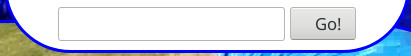
Above: The search box at the top right of the page, just left of the RSS icon.
The search box on the previous version of the site worked using some search code that I had written. It worked really well for what I wanted. But wasn’t viable on the new set up, so I’ve just pointed it at google for now. This will likely evolve in time.
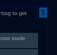
Above: The close button on a collapseable area on the old site.
This was a “because I can” feature, that I never actually had much intention of developing further so it would actually be useful. There were no cookies or other state backing it, so it would show up when the page was next refreshed. So I got rid of that functionality for this version of the site. I still have the code, so if I ever have a reason to re-introduce it, I’ll do so at that point.
Above: A really old screenshot of my first FunnyHacks website.